What You Didn’t Know About Eagan’s Website Update
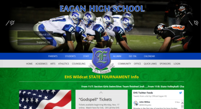
Screenshot by Olivia Weinberger
The home page of the updated website.
November 10, 2014
On October 10, the school website underwent some major design changes. Ms. Anderson, Eagan’s web administrator and the English department chair, discussed the process that went into making these developments and gave some helpful tips for users of the site.
The site receives approximately 200,000-250,000 hits a month, depending on the time of year. The site caters to a variety of different types of users.
“The reason why we have a website is mainly for students… But it’s also about communication to parents,” she explains. “The [four] groups that use it are students, teachers, parents, [and community members].” Additionally, newspapers and other local members of the press check EHS’s website for information on news stories relating to the school. The sheer numbers of people using and depending on the website contributed to the decision to make a change.
There were other reasons for the update to the website as well. “It hadn’t been changed since 1997,” Ms. Anderson bluntly stated. “And it just… it looked old. It’s the 25th year anniversary [of Eagan High School]. We thought, 25 years. It’s a good time to change.”
Ms. Kasdorf, Eagan’s ITC secretary, even designed a special logo for the site in honor of the school’s 25th. The commemorative crest can be found near the top of the webpage, directly in the center.
The updated design had been in development for a long time, and a lot of thought and hard work went into it. Ms. Anderson said, “We met with people last spring from the company that designs the website and we talked about new looks… What was in, what we wanted to do, and what we were looking for. They call this [style] “romantic.” A more romantic homepage. It’s prettier, you want to look at it… We don’t doubt that a lot of people were looking at our website for information, but it was boring, and it was middle-schoolish. It was time.”
However, Ms. Anderson knows firsthand the repercussions that big changes can bring. “We fielded a lot of calls at the beginning, you know: ‘What happened to [blank]?’ ‘Where’s my [blank]?’”
Many people were having problems loading the website because the modernized site doesn’t perform optimally in old browsers such as Internet Explorer or AOL. The new design is more minimal, meaning that the homepage doesn’t have long lists of links like the old website did. This makes it harder and more confusing for some users to find information. Something else users seem to miss is the old calendar icon. The same calendar can still be accessed by clicking “Calendar” on the upper-right of the homepage, but people preferred seeing something that actually looked like a calendar. Other common gripes are that things just generally look different and are in different places. Ms. Anderson summed up the community’s overall sentiment well, simply stating; “People don’t like change.”
Thankfully, the most common issues with the website are easy fixes. Use a modern web browser when accessing the site (don’t use Internet Explorer or AOL). Links to information that used to be displayed on the old homepage are under the “Student” and “Parent” pages. The student page is very similar to the way the old homepage was laid out, with a lot of the same kinds of information. If you need a permission form or the link to a website the school uses, check that page.
“Everything that comes in, we try and put it on the student page or the parent page,” Ms. Anderson explained. This is why you should always check those places first for any current, up-to-date links that you need. If you need to check the schedule, remember to go to the calendar page: It even features a calendar icon reminiscent of the old one.
Despite the initial confusion, the updated design of the website has many benefits, and is already improving the experience of its users. For example, the mobile version of the site works extremely well. “It’s very user-friendly on the phone, but it’s different. And people (especially people over the age of 40)… don’t like different.” Ms. Anderson said.
Additionally, the Twitter feed embedded into the homepage is a huge asset. It allows important Eagan news to be updated automatically and immediately by reliable sources via their tweets. On the old website, this sort of information would have to be updated manually by Ms. Anderson, who couldn’t always hear about the news as soon as it occurred. She gave an example of how this new feature was put to use recently:
“On the front of our website, it said, ‘Girls going to State for volleyball,’ within two minutes of it happening. Which is really cool. That’s what people want.”
One of the most amazing things about the website is that it actually pays for itself. Local sponsors pay to advertise on the site. The money they give is used for upkeep and updates, including the last one. “So, taxpayers, no further cost to you!” Ms. Anderson said proudly.
While most of the big changes have been made, redesign of the website is far from over. “We’re still tweaking, we’re still playing,” said Ms. Anderson. Staff members are hard at work trying to make the website more comfortable for students and other users. There are also plans for similar projects in the future.
“The next step is getting the Eagan Facebook page going,” Ms. Anderson said. “And that’s my baby too. It’s like running two huge corporations though… It’s overwhelming.” All her hard work for the school, however, will surely pay off in the long run.